

What is this project?
I chose to re-design the website for Aspen Art Museum because I believed the website did not give enough credit to the amazing art and exhibitions that they showcase. Being an aspiring designer myself, a lot of times whenever I am asked about my field, people tend to assume that my field is only based on drawing, painting and photography. I believe art and design are amazing fields which can communicate so much more than words can explain. These fields are based on feelings and expression. Artwork can speak to you if you try to connect with it emotionally. My goal was to bring about awareness about art being a medium of expression rather than a skill-based profession through this design.

Overview
Home
Start off the website's navigation with an introduction, location, hours and quick links for users to access easily.

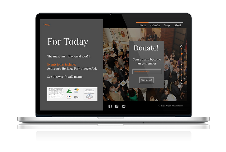
Announcements
View new events and information, donation links, and important updates to the museum's schedule and functioning.
Exhibition Spotlight
Dedicated to singular exhibitions, these spotlights include bold and appealing visuals to showcase the exhibition and include dates and an abstract to attract the user.


Footer
Instead of a traditional website footer, this design includes an entire page dedicated to bring attention to events, artists, and other interesting information from the footer.
User Research
Personas
How, where, why would users use my product?
My target audience is frequent museum go-ers but I also wanted to target people who would visit as tourists with the intention of sight-seeing but not necessarily museum hopping. Specifically, I wanted to target:
-
Students between the ages of 16 to 21 with a concentration in art, design, history or any other creative field as well as
-
Adults between the ages of 21 and 60, who are into travel and sightseeing but also have an appreciation for art, history and design

User Pain Points
Existing webpage issues
-
The webpage is too plain and does not showcase the museum's art enough to catch the audience's attention
-
The font is too bold, small in size and difficult to read
-
Announcements and special events are scattered throughout the page and are lost among the images
-
Event image icons are too small
-
Donation link is obscure and could be missed by potential donators
Wireframes
Wireframes
Creating a basic idea of the layout of my app
I wanted to create an interface which is different and exciting, to be able to attract more users and visitors for the museum. I created a kind of slideshow interface, which would behave like a vertical slideshow, controlled by a scroll bar and navigation. The main layout draws attention to the exhibition images and heading text.

Color scheme
An initial palette of colors for the design
I chose a mainly monochrome color palette to draw more attention to the art and exhibition images than the color scheme.

User Testing
Overall Design and Functionality
Goals for testing
1
2
3
Test the product concept and prototype.
Figure out the gaps in functionality causing confusion and frustration.
Identify additions that the users would like to see in the app interface or concept.
First Prototype
Specific changes

The interface should be left to right for easy legibility
Use dots instead of numbers so icons don't have to be chronological.
Change pink pop color to more gender neutral

Text overlaps the image making it hard to read
Nothing to prompt scrolling
Testing Summary
User Feedback
-
Flip the two horizontal sections to make the layout and text more legible (reading left to right).
-
The look resembles a high-end fancy website.
-
The pink pop color gives feminine vibes. Try to choose a color that is more gender neutral.
-
Ideas: Use a navy blue, forest green with a lighter gray background.
-
-
Scroll bar
-
Use dots instead of numbers so icons don't have to be chronological.
-
Use the same pop color for both scroll bar and numbers.
-
-
Slides
-
Have a sneak peak of "what’s to come" or arrows to prompt scrolling.
-
The current interface doesn’t look like the slides will move.
-
-
Homepage
-
Add imagery and legible text content.
-
Maybe something similar to the layout of ‘Where the lights in my heart go.”
-
Iterating the design
For my next iteration, I switched the orientation from left to right, with the image on the right. I also changed the spot color from pink to orange because the pink seemed to direct the website more towards the feminine population. I also changed the main text colors and included more imagery. I also changed the scroll bar to a more geometric design.
Final Design
Hi-fi Mockups
Color Scheme


Final Thoughts
I believe my final draft was more successful in communicating my call to action and encouraging people to pay more attention to artwork and imagery. The stark contrast between the background, imagery and text looks much brighter and draws the most attention to imagery and the main exhibition names, without being too dull or gray. Testing has proven the design to be easy and straightforward to navigate and to attract all kinds of audiences. The slideshow layout is also unique and more aesthetically designed element which goes with the overall vibe of the website.
Challenges
-
I developed an initial design before the wireframes which made me ignore many key elements of design like the left-to-right interface. I learned that initial brainstorming and user input is very important in developing a design!
-
This project was one of my first human-centered design projects, so I learned how to put the user's ideas and pain points first, then create a design to make their lives easier.
Future Steps
-
A design is never perfect so keep iterating and learning!
-
I hope to develop this design concept into a real application to be used in the job market.