What is this project?
Opportunity
This app is part of a class assignment for which the prompt was to design, build and user-test a prototype for a web or mobile application that solves a problem related to equity, for a target audience.
Solution
My app is a job-search app geared mainly towards women and bridging the wage gap. The app relies on a short quiz to collect data from the user about their current job profiles, location, salary, etc, to then construct a profile and calculate the wage gap percentage for their specific case. The app also offers resources to women for negotiating their pay and explains this wage gap issue and how to combat it. Using the interactivity and overall functionality of this app, I hope to create an empowering support system for women facing unequal pay across the globe.

Solution Overview
Final Result mockups and features
Home
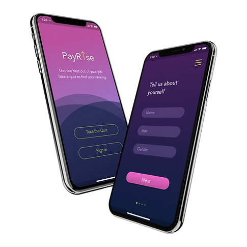
Start off the app's navigation with an introduction and basic task options. Users also have the option of a side menu, useful for returning users who know where they want to go in the app.


Quiz and Results
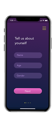
The quiz element collects the user's basic information, using which the user's wage gap percent range is calculated and displayed on a final results page. This includes links to search for jobs by category or use the side menu to navigate elsewhere.
Job Search
Users can search for jobs by category or using keywords. They can also use wage gap percentage to search for jobs within the same or different ranges. The job-search page can be accessed through the quiz results pages as well as from the side menu.


Resources
Access external resources for guidance or advice on certain issues in their careers, or to learn more about the wage gap and how to reduce it.
Main Menu
This menu includes access to user profiles, sign in pages, the wage gap quiz, the job-search page, more resources, and app settings.


User Research
Personas, Product Comparisons, Storyboarding research methods
Personas
How, where, why would users use my product?
My target audience is women and the community of people who are affected by the wage gap, but are unable to avoid it. I hope to be able to target this feminine audience and encourage them to bridge the wage gap through an empowering support system and an effective job-search. My targeted age group is between 18 to 65 years old, which includes anyone who has the possibility of employment and an ability to combat the wage gap. For this, I created 2 personas, encompassing different people of different ages and job profiles.


SWOT Analysis
Existing products comparisons
-
There are many existing job-search products out there such as Monster, Glassdoor, Indeed etc.
-
My product is more interactivity-based but also gives out information about problems that people may face in their jobs.
-
The problems my app will address are job satisfaction, mental health, gender equality and pay equity, which have not been tackled in an app specifically targeted towards women.
-
The app is mainly geared towards women since I am trying to bring the wage gap between men and women to their attention and create awareness about it.
-
I hope to give women a chance to personalize the app and be able to search for jobs which fit their criteria in case of job type, location, and being able to compare jobs to choose the right paying job for them.
Storyboarding
How, where, why would users use my product?
Current Situation
-
Unhappy with her salary & overworked
-
Was sidelined against a male employee for a raise she asked for months ago
-
Does not feel appreciated at her workplace
How would they use my app?
-
Look for jobs which have a little to none wage gap between men & women
-
A job where she feels included & valued
-
Find help about negotiating a salary
Person 1
Person 2
Current Situation
-
Experienced, pregnant individual looking for jobs as a mechanical engineer
-
Wants flexible hours & reasonable pay
-
Prefers nearby locations for convenience
-
Her current company has a low ratio of women to men
-
Wants to advance in her career but does not see potential for growth
How would they use my app?
-
Find a job with all her preferences
-
Be able to compare characteristics like growth potential in her field & location
-
Find companies with flexible hours
Current Situation
-
An individual, currently doing a travel job in which the company reimburses him for travel costs but not food & stay
-
She has negotiated a potential raise or extra reimbursement but has been put off
How would they use my app?
-
Find a company with better equity & lower wage gap
-
Compare wage gaps for jobs anywhere since she has no location preferences
-
Compare job benefits & ratings
Person 3
Current Situation
-
Currently very happy working at a company which treats her with respect and equity
-
Looking to move into another sector within her field of work
-
Current company does not have open positions available within that field
How would they use my app?
-
Compare current job and its characteristics with other similar-paying and rated jobs
-
She can narrow her search for companies with job satisfaction and pay equity filters
Person 4

User Experience
User Flows, Wireframes, Color Palette
User Flow and Site Maps
Creating a map of my app's navigation
I created a flowchart with the app screen and button to explain where each function would take the user. The format is screen/button going to the next screen/button. Using this chart, I was able to figure out any holes in my thinking and make the app easier to navigate.

Wireframes
Creating a basic idea of the layout of my app
I wanted to create an interface which is different and exciting, but also something which looked professional enough to be a job-search app. I incorporated a straightforward layout with lots of pages, to make the navigation and app flow a little easier for the user. I also used a lot of icons throughout my design, to make sure the app remains interactive and visual for the user.

Color scheme
An initial palette of colors for the design
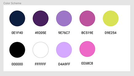
I wanted to diverge from the common palette of a light background and dark text and try something reversed, with a dark background but bright colors for functional elements and text.


User Testing
Testing Goals, first prototype, critique, participants, and results
Overall Design and Functionality
Goals for testing
1
2
3
Test the product concept and prototype with a specific task given to users.
Figure out the gaps in functionality causing confusion and frustration.
Identify additions that the users would like to see in the app interface or concept.
First Prototype
Initial design and specific changes
Too small to read comfortably
Two buttons too close to each other
Round and rectangular
aesthetic clashes


Font and color makes text hard to read for people with disabilities
Boxes do not look like text input boxes
Current interface does not prompt scrolling
Text color on current background is slightly hard to read
Menu buttons are universally located on the right side


Testing Summary
Participant Profiles
Testing the product with a varying participant profiles

User Feedback
Using this testing, I was able to figure out many holes in my thinking in terms of navigation and functionality. I gained a lot of insights into what could confuse users and how I can make this process easier for them. I also gained a lot of praise for using imagery and a different kind of color scheme to attract the users attention.
Iterating the design
For my next iteration, I fixed the main menu and adding a section which re-directs to women’s resources such as negotiating pay. I also added small features like back buttons, scroll bars, etc to make the user experience better. To make my app more accessible for people with disabilities, I made my text boxes and some other elements on my page a little more visible for the user to see.

Final Result
Hi-fi Mockups, final color scheme, next steps
Hi-fi Mockups

Color Scheme

Final Design


Project Thoughts
Learnings and next steps
Learnings
I think my final draft effectively conveys everything I hoped to implement. The app gives people a chance to personally get acquainted with the wage gap and realize how it could be affecting them. Using the quiz information, the app then provides people with the resources they need to fight against pay inequality. I hope that this app is something which I could potentially develop into something real and helpful for future generations.
Challenges
-
I began thinking about the design much before I could test out my navigation and user flows and ended up having to change too many elements of my design, unnecessarily spending extra time on it. I learned that user input is very important in developing a design!
-
This project was one of my first human-centered design projects, so I learned how to put the user's ideas and pain points first, then create a design to make their lives easier.
Future Steps
-
A design is never perfect so keep iterating and learning!
-
I hope to develop this design concept into a real application to be used in the job market.

