
Deep Research for Alexa+
Designing a mode that turns a conversational assistant into a powerful research engine, without making it feel like a different product.
In progress • Not yet launched
Role
Lead UX Designer
Status
Vision complete · Pre-engineering
Not yet launched or tested
Platform
Alexa+ Web and Mobile
Timeline
2-4 months
Problem
Alexa+ users want to go deeper but product limitations didn't let them.
Customers coming to Alexa+ text endpoints were expecting to make Alexa their personal companion, which included answers beyond simple one-off responses. They were arriving with questions that needed real research, for example trip planning for a family, comparing products online, understanding a diagnosis, etc. The existing experience had limited capability to provide such in-depth analysis.
Our brief was to build an Alexa+ version of Nova, Amazon's deep research model and our ceiling product set. The designs would need to stay tethered to what the model could actually produce, meaning we couldn't design for information we wouldn't have. But even within that constraint, there was significant room to go further than Nova's current structure and visuals.
A hard requirement from product: no degradation of existing Alexa+ functionality while in Deep Research mode, or when returning to prior Deep Research sessions from any endpoint. The mode had to be fully additive.
About Nova

Nova is Amazon's internal research model that surfaces everything it produces during research including dense, unfiltered content like every step, every individual source, and lots of explanatory text needing extra verification and filtering.
While this may be ideal for a more technical audience, Alexa's audience fell into the category of a household user trying to plan a trip.
My contribution
1
Reduced text overload
Identifying what the user actually needs to see vs. what the model produces.
2
Mimic AI thinking
Organized the research process into sequential, readable, and purposeful information.
3
Surfacing and drawing attention to the goal
Made the agent process collapsible so the generated report is always the primary content, not the trace.
4
Build and maintain trust
Added inline citations and a sources panel so users can verify information without leaving the chat.
5
Latency masking and re-discovery
Brainstormed a structure (IA) for a multi-minute wait: notifications, badges, and progress indicators, so users can start a new chat and return when their response/report is ready.
6
Optimized the agent bar
Redesigned the agent input bar to carry status indicators for active modes, creating an extensible system for Deep Research, model selection, and future modes or features.
USER CONTEXT
Not a demographic, but a moment
For us, the target user didn't depend on demographic but by the moment a conversation changes from a simple back-and-forth, to a question that's too complex for a quick answer and too time-consuming to research manually. For example, a parent comparing preschools, a first-time homebuyer, a student writing a report on a topic they don't understand yet.
These use cases span household productivity, health planning, financial decisions, travel, education, and home improvement. What they share is the same underlying need: comprehensive output they can act on, not a paragraph to skim.
These use cases were generated by product teams based on general Alexa+ usage. No formal user research was conducted. Design decisions were grounded in stakeholder input, the product requirements set, and competitive signals from the audit below.
Competitor Audit

Competitor Visual Audit

Competitor Interaction Analysis
Before touching any screens, I audited ChatGPT, Gemini, CoPilot, and Claude across five dimensions: entry point, how the chat changes visually, wait state behavior, output format, and mode exit. The goal was to understand what users already expect from AI research products before arriving at Alexa+.
What the audit told us
Transparency during the wait is table stakes. Both ChatGPT and Gemini show users exactly what the agent is doing in real time. A spinner alone would feel like a regression.
The output needs to read as a document. Every competitor that does this well draws a visual distinction between the research report and the conversational thread it lives in. That distinction is what makes output feel trustworthy and shareable.
Mode entry should be low friction and reversible. Products that gate Deep Research behind settings pages create unnecessary friction. The strongest pattern is an input-bar-level affordance that's always visible and instantly toggled off.
KEY DECISIONS
The work behind the work
01
The entry point: input bar toggle
Deep Research needed an entry point that was discoverable without adding visual noise. The challenge was designing an affordance that communicates 'this is a different mode' without complicating an input bar that already carries a lot of function.
The exploration was extensive including placement exploration, rough mocks for single-line and double-line input variants, floating buttons, suggestion pills, nav bar integration, etc. Each had trade-offs around discoverability, screen real estate, and conflict with existing interaction patterns. I also created quick prototypes with AI tools like Kiro and Figma prototyping to test out these interactions and discover holes in my thinking before moving forward.

Toggle for model change: placement explorations
Narrowed down explorations for chat bar interactions
Solution
Deep Research lives in the input bar's plus-menu dropdown in its default state, and appears as a persistent labeled tag on the input bar when active. The tag communicates mode status at all times without requiring the user to remember what they enabled. Tapping it again exits the mode immediately.
The agent bar layout and enablement CX is still under Engineering exploration for feasibility. Since this element risks making or breaking the discovery and continuing experience for customers, I intentionally decided to move past the existing design system and create custom components and layouts to optimize agent bar interactions.


Visual explorations of how to enable research mode
02
The input bar as a status system
Redesigning the entry point for Deep Research surfaced a broader question: how does the chat input bar communicate multiple active states like Deep Research mode, model selection, plug-ins, etc. simultaneously without becoming cluttered?
Rather than treating this as a one-off toggle, I designed the input bar as an extensible status system. Active modes appear as labeled tags directly on the bar, each independently togglable. This creates a consistent pattern the product can scale into as more capabilities are added, without requiring a new design solution each time.


Two-lined agent bar with multiple badges

Icon badges in one line
While this is a good start to the structure and behavior of badges, when multiple features are introduced, a combined investigation will need to happen between design and engineering to determine rules like:
-
How many modes can be active at once?
-
Can badges be stacked?
-
Is there a priority order?
-
Are there rules about which badges cannot be selected together?
These questions will come into play when the scope is expanded post initial implementation.
03
Making a multi-minute wait feel intentional
Deep Research takes a long time, sometimes several minutes. The worst version of this is a spinner with no context. To handle the latency problem, I pushed toward using the information we had to have customers perceive a lower wait time, or skip the wait time entirely by multi-tasking.
Transparency: A live agent activity feed shows exactly what the model is doing at each step like researching topics, browsing sources, putting together a format, etc. This reframes waiting as witnessing and creates a perception of a lower wait time since the user is able to watch the work progress.
Escape: A 'Notify me' prompt lets users leave entirely. They can start a new chat, switch tabs, or put their phone down. A push notification (mobile P0) or browser notification (web P1) brings them back when the report is ready.
Background continuity: While research runs, a persistent progress indicator lives in the tab, app badge, or browser, so users who navigate away always have a signal that something is happening without needing to return to check.

Steps showing ongoing progress

Notification to 'Notify' when
research is complete
04
Side panel, not inline
Product's initial direction was to surface the full agent breakdown, every step, every source as an inline element in the chat thread. The data was available from the model, so the instinct was to show it.
My pushback: available information and useful information are not the same thing. A user who just asked Alexa to plan their family's trip to Hawaii does not need to read 40 lines of agent process before they see the itinerary. That volume of process information buries the output that actually matters.
The resolution was a collapsible side panel for the research process. The generated report is the primary content in chat. The full agent process is a click away for users who want it, and completely invisible for those who don't. The collapsible format also means the panel doesn't anchor users to a long, scrolling list before getting to the real content.


In-line research content shown as a chat thread V.S. a collapsible fragment that opens into a side panel
05
The report as a document, not a response
The Nova baseline rendered the report directly in the chat as a long, scrollable output, visually indistinguishable from a normal Alexa response. There was no clear affordance that it was a distinct artifact, downloadable, or shareable.
My design makes the report a visually separate object. It sits in a bounding box with a slightly darker background, clearly set apart from the conversational thread around it. The border communicates that this is a document, not a response.
There were two layout variants were explored:
-
Full preview: the complete report rendered in chat, with action buttons at both the top and bottom so downloading is accessible without requiring a scroll to the end.
-
Collapsed preview: the report fades and truncates after a few lines, similar to how paywalled articles appear on NYT or WSJ, and expands on tap. This reduces the visual weight of the report in the chat thread while preserving full access.
Both variants include a full action bar: copy, download (TXT, DOCX), share, regenerate, thumbs up/down feedback, and a sources button that opens the citations panel.
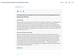

Full preview variant with action bar at top and bottom

Collapsed preview variant with fade and expand affordance
USER FLOW
From toggle to report
The end-to-end screen progression of Deep Research including landing, agent bar active, mode menu, thinking state, output with side panel, final report, and mode exit.

Deep Research on Web

Deep Research on Mobile
SCOPE
What's designed, what's next?
Deep Research creation is set to be available on web and mobile as the initial launch. Future plans include initiating Deep Research from Echo devices with voice input and output delivered to web/mobile. Elements like browser notifications, running activity indicators, etc. are also scoped for further iteration.
Engineering Handoff
With the vision delivered to engineering teams, the investigation of whether this feature is buildable with our current infrastructure determines our next steps. I'm expecting more questions to tackle after this investigation and a lot more iteration before we get to a launch state.
Success Criteria
With feasibility scoping in progress and no fixed launch date, there is currently no testing plan is in place. Formal success metrics haven't been defined yet but some questions I'd want to answer once we get there:
• What percentage of users who initiate Deep Research return to view the completed report?
• Does the Notify me feature meaningfully increase report completion rates?
• Do users who engage with the collapsible process panel have higher satisfaction scores than those who don't?
• What is the report download rate and does format preference (TXT vs. DOCX) vary by user segment?
• Do users who receive a push notification re-engage at higher rates than those who don't?
FUTURE CONSIDERATIONS
Not in scope but necessary to consider
01
Re-entry state
What happens when the user comes back?
A flow that ends at 'report complete' is incomplete. There may be instances of follow-up questions, edit requests, re-generation of full or partial text, generating images to go with the report, generating a summary, etc. The re-entry experience needs to be designed for this product to have continued use.
02
Edge Cases and Failure States
What happens when things go wrong?
A deeper dive into edge cases and potential error handling will likely surface more open questions like:
-
What happens if Deep Research fails or times out mid-run? What does the user see?
-
Is there a retry affordance?
-
What if the agent can't find enough sources for a comprehensive answer?
-
Is a partial report a possibility, or would Alexa prompt the user to refine the query?
-
What if the query is too vague to begin research?
Without error handling, our risk of losing trust with customers is extremely high and could be fatal for the feature. Accounting for for these cases will reduce frustration and customer drop-off in case something goes wrong.
REFLECTION
What I'd carry forward
The highest-leverage moment on this project wasn't a visual decision but the conversation about what belongs in the chat thread. Product wanted the full agent process inline because the data was available. While the immediate instinct may have been to use everything we have and be transparent, there is a thin line between transparency and overloading with irrelevant information. Available information and useful information are not the same thing.
Working solo against a constrained baseline meant every decision had to be clearly reasoned and clearly communicable to stakeholders without another designer to pressure-test it. The work was in knowing which constraints were real and which were assumptions, and pushing thoughtfully on the ones that were assumptions. One of the biggest examples of this was that generating a report is the end of the flow. However, this isn't the end but the point of break-off where multiple follow-up processes begin, and are extremely important for trust and reliability in the long run.
If I had one more phase before engineering handoff, I'd run usability tests on two things specifically: the collapsible side panel (does it get discovered?), and the re-entry experience after a notification (does the user immediately understand what they're looking at?). Those are the two highest-risk interactions in the flow.
This project is pre-engineering and has not undergone usability testing.
The project vision is complete and designs are awaiting engineering follow-up.